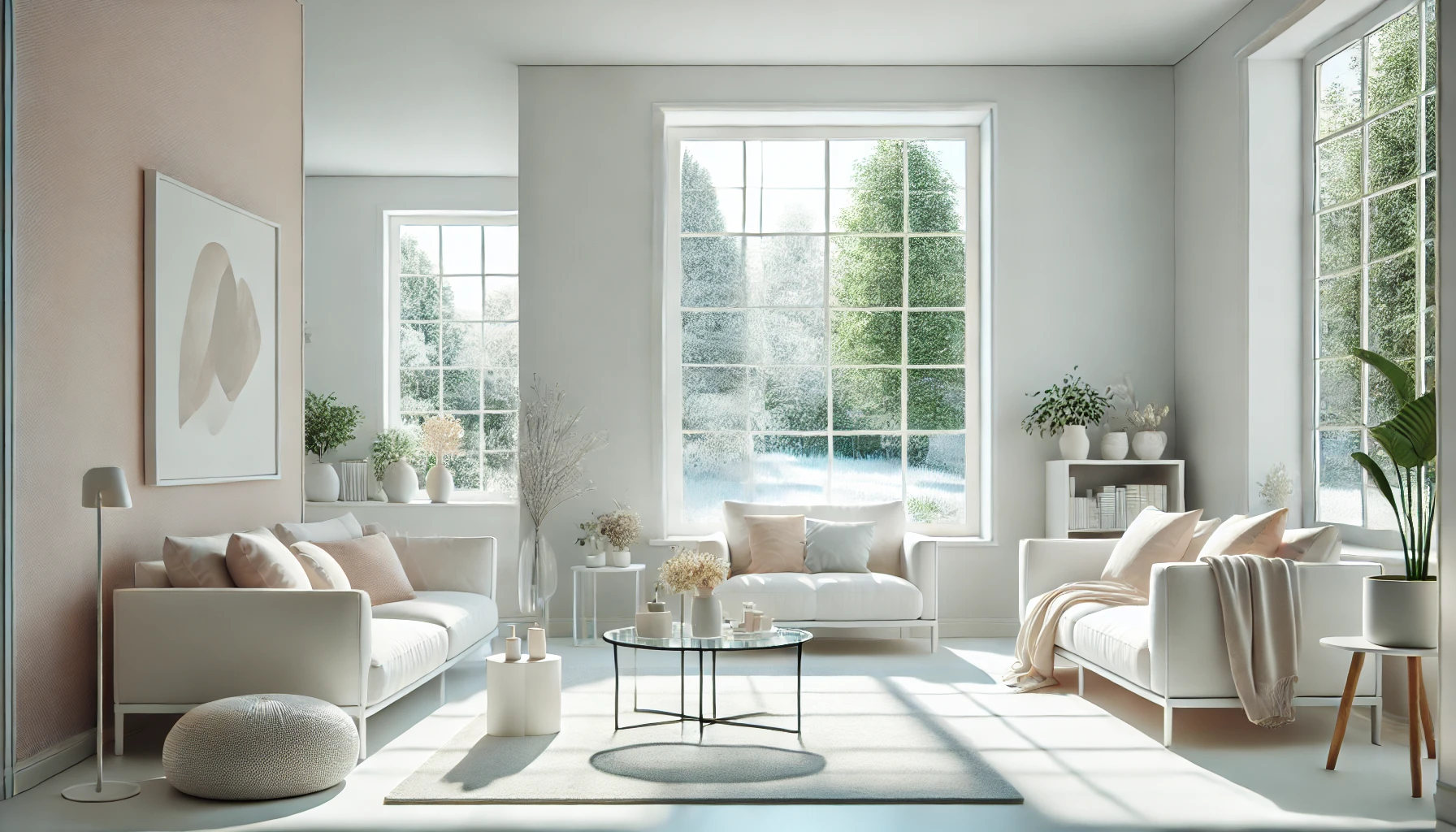
When decorating a small or dimly lit room, choosing the right paint colors can significantly impact how spacious and bright the space feels. Light, neutral, and reflective colors create the illusion of openness by bouncing light around the room, making it appear larger and airier. This article will explore the best paint colors for making a room feel bigger and brighter, along with practical tips on application techniques and complementary décor choices.
How Colors Affect Perception of Space
Before diving into specific colors, it’s important to understand how colors influence spatial perception.
- Lighter Colors Reflect Light – Light shades, such as whites, pastels, and soft neutrals, help bounce natural and artificial light around a room, making it appear larger and more open.
- Darker Colors Absorb Light – While deep colors can add coziness and drama, they tend to make a space feel more enclosed and smaller.
- Cool Colors Recede – Blues, greens, and cool grays create the illusion of depth, giving the appearance of more space.
- Warm Colors Advance – Warm hues like reds and yellows can make a room feel more inviting but may also make it seem smaller.
Now, let’s explore the best paint colors to achieve a bigger, brighter-looking space.
Best Paint Colors to Make a Room Look Bigger and Brighter
1. Soft White Shades
White is a timeless choice for small spaces. It creates a clean and fresh aesthetic while maximizing brightness. Some of the best white shades include:
- Pure White – Crisp and bright, reflecting the most light.
- Off-White – A slightly warm undertone for a cozy, inviting feel.
- Ivory or Cream – Softer than stark white but still bright and open.
Best for: Small living rooms, kitchens, and modern minimalist interiors.
Tip: Pair white walls with light-colored furniture and mirrors to enhance the spacious feel.
2. Light Gray
Gray is a sophisticated and versatile neutral that works well in modern and traditional spaces. Light gray tones help reflect light while adding subtle depth. Some great options include:
- Cool Gray – Has a bluish undertone, making the room feel open and airy.
- Warm Gray (Greige) – A blend of gray and beige that feels inviting yet expansive.
Best for: Bedrooms, offices, and transitional spaces.
Tip: Use a satin or eggshell finish for a slightly reflective effect that enhances brightness.
3. Pale Blue
Cool tones like pale blue create an illusion of space by visually receding walls. Lighter blues also promote a calm and serene ambiance. Great choices include:
- Sky Blue – A soft, airy blue that makes ceilings seem higher.
- Powder Blue – A pastel hue that keeps the space fresh and bright.
Best for: Bedrooms, bathrooms, and coastal-inspired rooms.
Tip: Combine with white trim and light wooden furniture for a clean and open look.
4. Soft Pastels (Blush, Mint, and Lavender)
Pastel shades can add a subtle touch of color without overwhelming the space. These hues brighten up a room while keeping it feeling light and airy.
- Blush Pink – A warm, soft tone that adds a gentle glow.
- Mint Green – A fresh and uplifting shade that brings a natural feel.
- Lavender – A light purple hue with a calming effect.
Best for: Nurseries, small bedrooms, and creative spaces.
Tip: Use pastel-colored walls with white or neutral-colored furniture for a balanced look.
5. Light Beige and Taupe
If you prefer a warm and cozy look without making the room feel smaller, light beige and taupe are excellent choices.
- Warm Beige – Adds a hint of warmth while still reflecting light.
- Soft Taupe – A sophisticated neutral with a grayish-brown undertone.
Best for: Living rooms, dining rooms, and traditional spaces.
Tip: Use light beige with cream or white accents to maintain an open, airy look.
6. Pale Green
Soft green shades bring a touch of nature into the home while maintaining a spacious feel. Lighter green tones work well for keeping a room bright and fresh.
- Sage Green – A muted, earthy tone that feels calming.
- Pistachio Green – A soft, pastel-like green that adds vibrancy.
Best for: Bedrooms, kitchens, and home offices.
Tip: Pair with natural elements like wood, rattan, or linen textures to enhance the fresh aesthetic.
Techniques to Enhance the Spacious Effect
1. Use Monochromatic Color Schemes
Painting walls, ceilings, and trim in the same or similar shades can create a seamless look that expands the space visually.
2. Paint Ceilings Lighter
A lighter ceiling (or even white) gives the illusion of height, making the room feel more open.
3. Use Vertical or Horizontal Stripes
Painting stripes (either vertical for height or horizontal for width) can stretch the visual perception of a space.
4. Opt for Glossy or Satin Finishes
A slight sheen in the paint finish helps reflect more light, making the room appear larger.
Additional Tips for Making a Room Look Bigger and Brighter
- Maximize Natural Light – Use sheer curtains instead of heavy drapes to let in more daylight.
- Incorporate Mirrors – Strategically placed mirrors reflect light and create an illusion of more space.
- Use Multi-Functional Furniture – Choose furniture with built-in storage to reduce clutter.
- Keep Decor Minimal – A clutter-free space automatically looks larger and more open.
- Add Metallic or Glass Accents – Reflective surfaces enhance the brightness and openness of a room.
Final Thoughts
Choosing the right paint colors can completely transform a small or dark space, making it appear bigger and brighter. Whether you prefer crisp whites, soft pastels, or cool blues, selecting the right shade and application technique can maximize light reflection and create a more open feel.
By pairing these colors with smart decor choices like mirrors, minimal clutter, and natural light, you can make any room feel airy and spacious. Start experimenting with these color ideas and enjoy the magic of a visually expanded space!